News
18 Aug 2015
40 Years Gone: MAGNT Updates Cyclone Tracey Exhibit With New Tech
Subscribe to CX E-News
Christmas Eve, 1974, is a date etched in the national Australian consciousness. When Cyclone Tracy hit Darwin, it destroyed 80 percent of its buildings, took the lives of 66 people and sparked the largest civil evacuation in the country’s history. The Museum and Art Gallery of the Northern Territory is tasked with keeping the stories of Tracy alive, and, on the 40th anniversary of the deadly storm, updated the Tracy exhibition using new technology to communicate the devastation and its consequences.
“The current exhibition was developed in 1994 as a community project,” explained Caddie Brain, Digital and Communications Manager at MAGNT. “It’s a special, commemorative place. People
were traumatised by Tracy and it had a huge impact on their lives. With the 40 year anniversary, through a grant from the NT government, we had the opportunity to redo parts of the exhibition
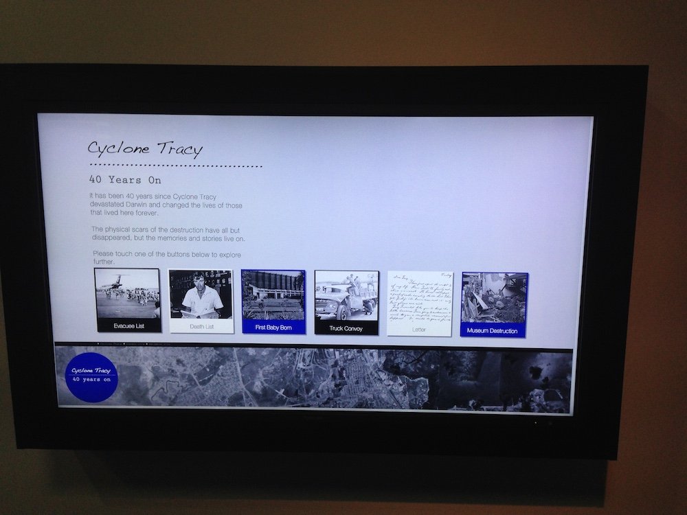
and tell the story in a different way. We wanted to add some interactivity into the space. The most important thing to us was make the evacuation lists and the list of the dead, which were manually typed and handwritten, accessible. They’ve only existed as pdfs for some time and they weren’t searchable. For a lot of people it’s the only formal record of what they went through during Tracy and after.”
Creative Content
The project made its way to integrator Rutledge AV through their NT Operations Manager Daniel Woodward. “MAGNT had a huge amount of content,” recalled Daniel. “They had strong ideas about what they wanted to do with it, but weren’t sure of the exact technical possibilities and how it could happen. Together, we worked out a technical solution through a series of meetings. We forged a roadmap and made a template for the project. MAGNT were really excited; the technology we introduced to them was an eye-opener and they were thrilled that they could do exactly what they wanted.”
This put Rutledge AV in the position of not only integrator, but content creator and curator. Kamila Marcinczak, Marketing Manager at Rutledge, has recently expanded her role to include duties as Creative Director on hybrid projects such as the Tracy exhibition. “Our initial pitch was a storyboard showing how we envisaged the displays to work,” explained Kamila. “We had to look at what was relevant, what would look good, and come up with something visually appealing that would fit with the colour schemes already used in the exhibition and the MAGNT’s brand guidelines. MAGNT then came back with some changes, and from then on, it was a smooth sailing, consultative approach.”
Touch and Feel
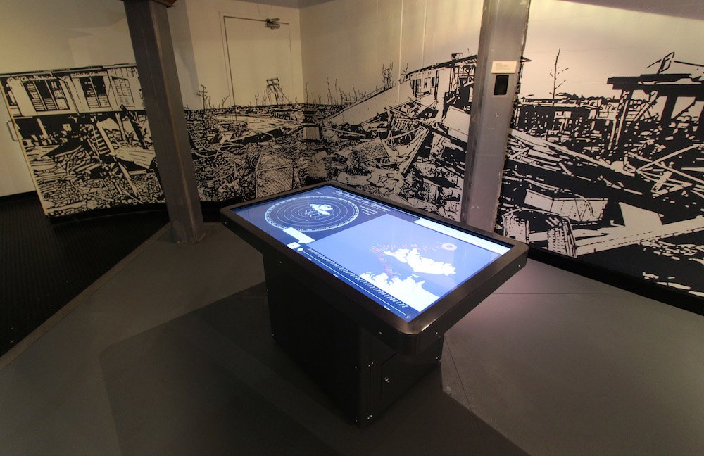
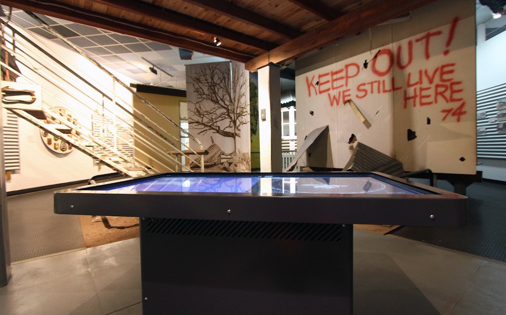
To add interactivity and intimacy to the exhibition, Rutledge AV and MAGNT chose to install a 55” Toshiba screen with an IR touch overlay set as a table, and a 47” Toshiba screen with IR touch overlay mounted on the wall. The wall screen was to display the searchable evacuation and death lists, which have proved to be the most popular part of the exhibition, as well as photo essays and stories from the aftermath. The touchable table displays an interactive ‘path of the cyclone’ animation and an intricate ‘then and now’ photo series in which visitors can compare ‘before and after’ images of the city compiled from photos taken in the weeks after Tracy with images captured on the same sites in 2014.
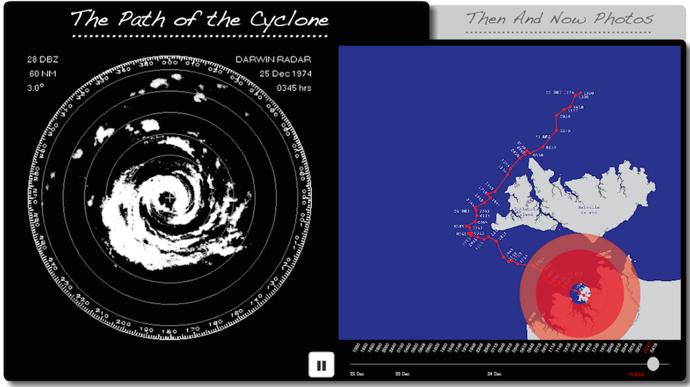
“The interactive table ‘path of the cyclone’ animation was made from Polaroid stills that the Bureau of Meteorology took of its radar,” continued Daniel, “those images showed the radius and cloud formation of the cyclone, to which we added colour representing wind speed and intensity, then overlayed the path over Darwin. Kamila designed a display that, as you slide a chronological scale, the intensity and path over Darwin changes. For the ‘then and now’ images, a local photographer took hi-res photos at the exact sites matching period photos. He spent a long time getting the alignment right; he hooked his camera output to his laptop, brought up the ‘then’ image and moved around until the angles were correct. The transitions are spot- on.”
Perceptive Users
All multimedia content runs in Flash via two local PCs connected to the screens via USB. Set to auto-boot up, and with features like pop-up keyboards disabled, the displays have been designed to run maintenance- free. Back at Rutledge’s Melbourne office, Software Engineer and Developer Isaac Dolling was in charge of bringing the vision to life in Flash. “The biggest challenge was making the evacuation and death lists searchable,” offered Isaac. “We solved it with xml parsing. We employed a third party to put all 700 pages into xml format that then referenced names back to page numbers in the pdfs. I chose Flash for the project because of the way it handles animation, and because the exhibition is a stand-alone system that doesn’t have to interact with anything else. We could have gone down the HTML5 path, but that would have been adding extra complexity for no real benefit.”
In addition to technical decisions, Isaac rates user experience as the hidden design challenges when creating a content experience. “Determining how the user would use it, as opposed to how we perceived it, changed a lot of things,” he elaborated. “Guiding users was the challenge. A lot of people got lost navigating the table system, and we didn’t envision that. We then revised the interface and added pop-ups that prompted them when a section finished and gave them something to click on. You often don’t realise a user interface isn’t intuitive until you take a step back and look at it through the eyes of the end user, and not someone who knows how the system works.”
Intimacy of Touch
Caddie Brain agrees, and recommends extensive user testing for any interface. “It’s really important that you spend time in your environment watching how users interact, and observe the behaviour of different demographics,” she continued. “You want to capture all aspects of user behaviour so it’s accessible and everyone has the best experience they can. For example, we did a lot to keep the navigation simple and consistent throughout. Then there were specific things, like with the path of the cyclone. There’s a play button, but we noticed people were clicking the map itself, so we made both start it. It seems good to create multiple entry points because everyone uses technology in a different way.”
While Caddie is excited by new technological possibilities, she cautions against being distracted from the goal of enhancing communication. “Putting technology in for technology’s sake doesn’t work; it has to serve the storytelling and enhance the audience’s involvement,” she stated. “Touchscreens take away the coldness that technology can present. They’re tactile; instead of being a passive viewer, you’re curating your own story. It creates time and space for the viewer. It’s been beautiful to watch as the technology has a great intimacy to it. The museum is now full of families searching these lists for their names and those of their friends, talking about their journey. It’s re-sparked those conversations. We’re in a really exciting time for museums. This technology provides us with such amazing ways to tell these stories.”
Kamila Marcinczak is enthusiastic about the new string to Rutledge AV’s bow. “We first started looking at content creation as part of our digital signage installations,” she said. “Previously, we were putting in the hardware but our clients had to go somewhere else for content. We’ve now created a new stream and can offer a full service. It’s about being proactive and showing clients what we can do. The feedback from clients and audiences has been great.”
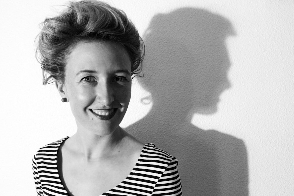
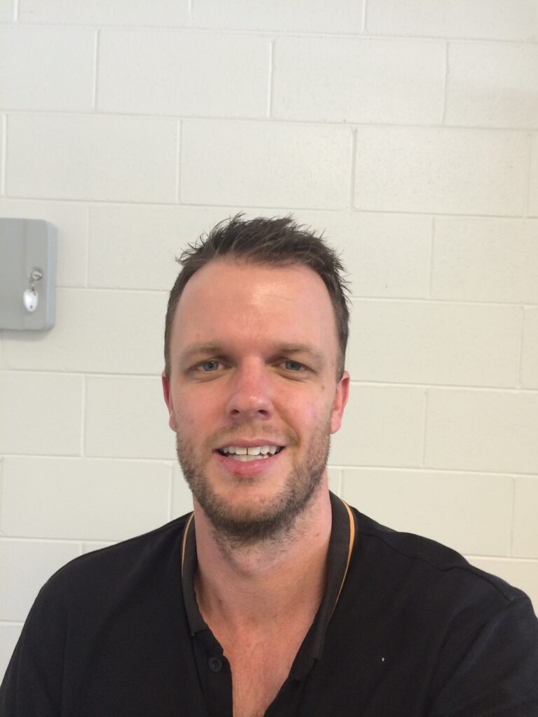
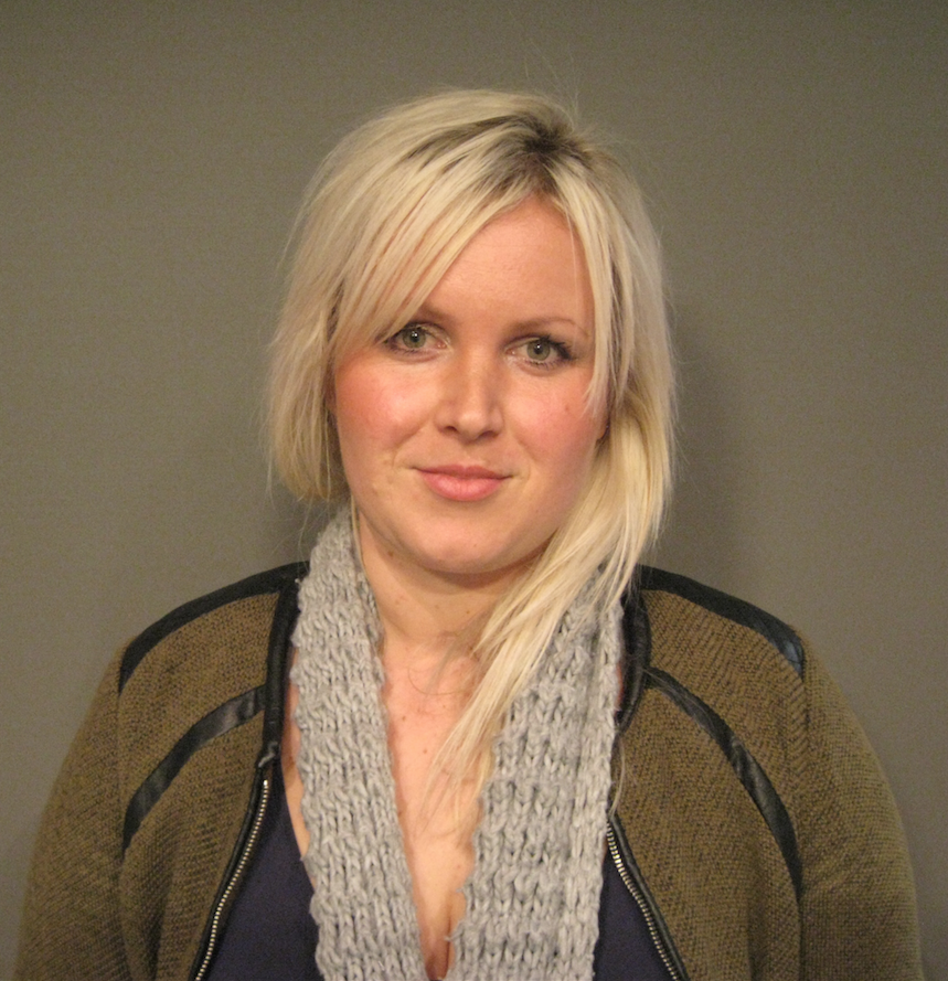
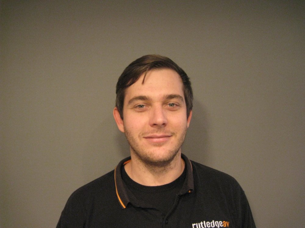 (Caddie Brain, Daniel Woodward, Kamila Marcinczak and Isaac Dolling)
Subscribe
Published monthly since 1991, our famous AV industry magazine is free for download or pay for print. Subscribers also receive CX News, our free weekly email with the latest industry news and jobs.

