News
18 Jul 2019
Integration Control – Don’t Make Me Think

Subscribe to CX E-News
CX JULY THEME: CONTROL
Integration Control – Don’t Make Me Think
by Simon Byrne.
Some of you would have read my piece about the incomprehensible state of house light controls in last month’s edition of CX. I see a lot of the same problems in the installed control systems as part of installations. That look of initial frustration because the user knows what needs to be achieved, but does not know how to do it. The user then cautiously starts pushing buttons, might have to call someone, followed by some more frustration as the system reacts in ways so as to make it just a challenge to get back to where they were when they started, then finally, the pleasant surprise when the touchscreen system actually carries out the user’s intention after having to navigate a series of incomprehensible icons.
This is not a complete surprise. Apparently there are no standards by which people can rely.
For example, in Australia we all drive on the left hand side of the road. It is a standard that everyone knows, so everyone relies on that, and it works. No thinking required. With system programming though, it seems that the programming road rules are being made up on every new installation. As well as no roadmap, the system programming is the last stage of its development.
The lion’s share of the money has been spent on hardware and fitout, and time is money, so the tendency is to get the implementation done as quickly as possible.
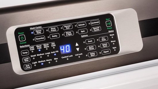
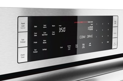
I have a modern, but astonishingly difficult to use oven in my kitchen. When I bought it, I thought I’d get a quality name brand unit so I bought a fancy-pants Bosch wall oven. This was a mistake.
Rather than using English to describe what the buttons and knobs do, it has twenty-six different icons. I bought the oven three years ago. I still don’t know what twenty-three of the icons do!
This is an extremely poor example of user interface design. And don’t get me started on our Miele clothes washer!
So what are some priorities in terms of making a control system user friendly?
Let me impose some of my thoughts on you: The most important question to ask is; how is the system going to be used in real life? Not what it can do, but how is it actually going to be used.
This should drive the overall process.
Be aware that what a client says and what they actually require are often very different. To make it more challenging, the client often does not know what they don’t know. That is human nature. I’ll often leave a job 70% done and unleash the client on it. That forces them to actually think properly, which distils their thinking, so you get a better brief.
Then test out the setup on other real users, and watch how they interact. This is often very telling.
Prioritise the key requirements above all else. Those are the must haves, and should not be compromised. Then and only then, the nice-to-haves may be incorporated, but only if they don’t impact on the must haves.
Think how the user is likely to think. You are a technical user who lives this stuff – end users don’t. So what seems logical to a techo is alien to them. It is up to you to interpret what they are trying to achieve and offer a solution.
Keep the graphic designers away. Useability is paramount and creatives often lose sight of that objective. If a design element makes something even slightly more confusing, it probably should not be there.
Use English; we learnt that in school. We didn’t have iconography classes in high school so resist the temptation to use them where a word works better. As a compromise, use icons with labels.
Have a back button. Always, always have a back button. The user must have a way to step back if they have made a mistake.
Do you really need a password? I’ve seen systems locked down for no apparent reason and, what is worse, timeout whilst an event is in progress.
Unintended consequences. Complex integrations sometimes have unintended configurations which stops the user from operating it in the way they want to. Great efforts should be made to get these bugs out of the system, but is also another reason for that back button.
And lastly think about this; if you have to conduct user training or write an instruction manual, maybe you have failed. Revisit why.
Back to that Miele clothes washer. When it completes a wash cycle, it shuts down, which is sensible, so well done Miele. But, to get the clothes out, one has to turn it back on, which involves it booting up which takes 15 seconds or so, only after which one can open the door.
If it is so smart, why doesn’t it open the door itself?
Rant ends…
CX Magazine – July 2019 Entertainment technology news and issues for Australia and New Zealand – in print and free online www.cxnetwork.com.au
© CX Media
Related reading: Can I have Full House Lights Please?
Subscribe
Published monthly since 1991, our famous AV industry magazine is free for download or pay for print. Subscribers also receive CX News, our free weekly email with the latest industry news and jobs.


