News
28 Oct 2015
Review: Soundcraft Si Impact

Subscribe to CX E-News
More for less

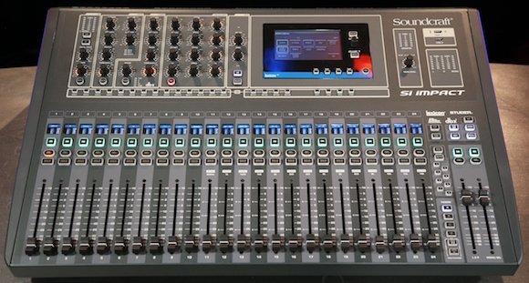
We first saw the Si series as we know it in the Compact, then Performer and Expression ranges. The Impact is not so much the latest iteration of the console, but the latest addition to the line. An important distinction is that whereas models such as the Si Compact are available in several frame sizes, the Si Impact is available in exactly one configuration.
The configuration is that of a 40 input console with 31 output busses (LR/Mono, 20 sub-group/aux busses, and 4 mono/stereo matrix busses. The surface operates in four configurable layers, with any channel, buss master or VCA assignable to any of the 24 flying faders. The remaining two faders are masters for LR and Mono (or the selected mix buss). The 40 input channels include 32 mono channels, and four stereos onto which the effect engines return.
The console supports up to 32 mic inputs on XLR, the last bank of eight inputs on combo jacks to provide a TRS option as well. 16 XLRs provide analogue outputs, with AES on a dedicated XLR of its own. Included with every console is a USB/MADI combo card which supports up to 64 channels across the two connectors – so you can connect 32 inputs via a Soundcraft stagebox and use the remaining allocation to support the 32in/32out USB interface. Or you can plug all your mics directly into the console and share the preamp outputs with another console via one cat6 crossover cable. If all that connectivity isn’t enough for you, there’s an additional card slot to give you even more options.
The whole console is a light grey colour, not dis-similar to other consoles on the market. Previous iterations in the Si line have used large slabs of metal in their construction, and the Impact basically holds true to this. The plastic end pieces feel a bit naff and cheap, but on the flipside the touch screen looks better, is more centralized, and maybe even a bit bigger than on previous generations of Si console. It’s also more precise in its operation and hence easier to use especially for operations such as typing channel names.
Within its frame size, the Impact is the most affordable Si console to date, and one of the ways this has been achieved is by the omission of rotary encoders for each channel. Thing is that this doesn’t really slow down operation of the console much – it’s certainly no slower to use than anything else of comparable specs. I found the Si Impact quite ‘snappy’ to operate, meaning that I can change pages on screens or layers on faders without having to consciously pause and wait for the action to take place. The Si Impact takes its time (around 46 seconds) to boot up, but once it’s running it works reliably and without any discernable interface lag.
Some of the included features on the Si Impact are especially noteworthy. First up you get up to 500mS of delay on every input and every output. It sounds like a little thing but actually this function occupies a significant chunk of DSP power, so it’s nice to know Soundcraft hasn’t gone shy on processing capacity. Every output has a BSS graphic, and every fader has faderglow and a multi-colour electronic scribble strip. VCAs and mute groups are standard.
The user interface on the touch screen will be familiar to users of previous generations of Si console, since it’s the same. Functions like ‘auto-complete’ in the patching menu save time. While there are no dedicated effect returns, the fact they come back on stereo channels (or a mono one if you configure them as such) means that you get full channel processing on your effect returns. The absence of this feature on many consoles is a source of irritation to me, so I was very pleased to see it included.
As with the Si Performer and Expression, the offline show editor for Si Impact is essentially an exact visual representation of the console. This means you’re forever trapped in a cycle of zooming in and out, and the buttons are all so tiny they require absolute precision cursor alignment to click. Names are shown above each channel strip, but you can’t just click the names to edit them, instead you must navigate the virtual menu screen. Also it only runs on Windows. As offline editors go it’s frustratingly slow to use, and one of the worst out there. Of course, if you don’t actually need to build shows offline then the whole point is irrelevant…
The iPad app on the other hand is well designed, responsive, and extraordinarily easy to get up and running. Connect a wireless router to the HiQnet port, check the HiQnet address on the console, punch that into the app, and you’re up and running. It’s fast, it’s responsive, and the navigation process is absolutely logical. Even while the console is being used to mix LR, the iPad can be used to mix to the other busses.
I’ve always found the Si range of consoles very appealing for two simple reasons – they’re inviting to use, and they sound good. This much still holds true of the Si Impact. In spite of the horrible offline app, I think the console is great and the overall ergonomics seem to make more sense than on previous generations. I love that the USB interface is included for free, so you can just as easily use it for recording (or even as a multi-channel audio interface for your computer!). It’s a great little piece of kit, and certainly capable of more than its demure appearance gives away.
Subscribe
Published monthly since 1991, our famous AV industry magazine is free for download or pay for print. Subscribers also receive CX News, our free weekly email with the latest industry news and jobs.


